Simplifying Investment Insights
Client
INVSTR
Category
FINTECH
My Role
SENIOR PRODUCT DESIGNER
Timeline
9 WEEKS

The original Stats feature overwhelmed users with dense financial jargon and data. Many struggled to understand their returns or justify upgrading to premium. We redesigned Stats to simplify insights and help users make smarter investment decisions.
Key Outcomes
+30%
increase in engagement with Stats within 30 days
70%
of tested users reported better understanding of their investment performance
3x
more users upgraded to premium after seeing redesigned Stats
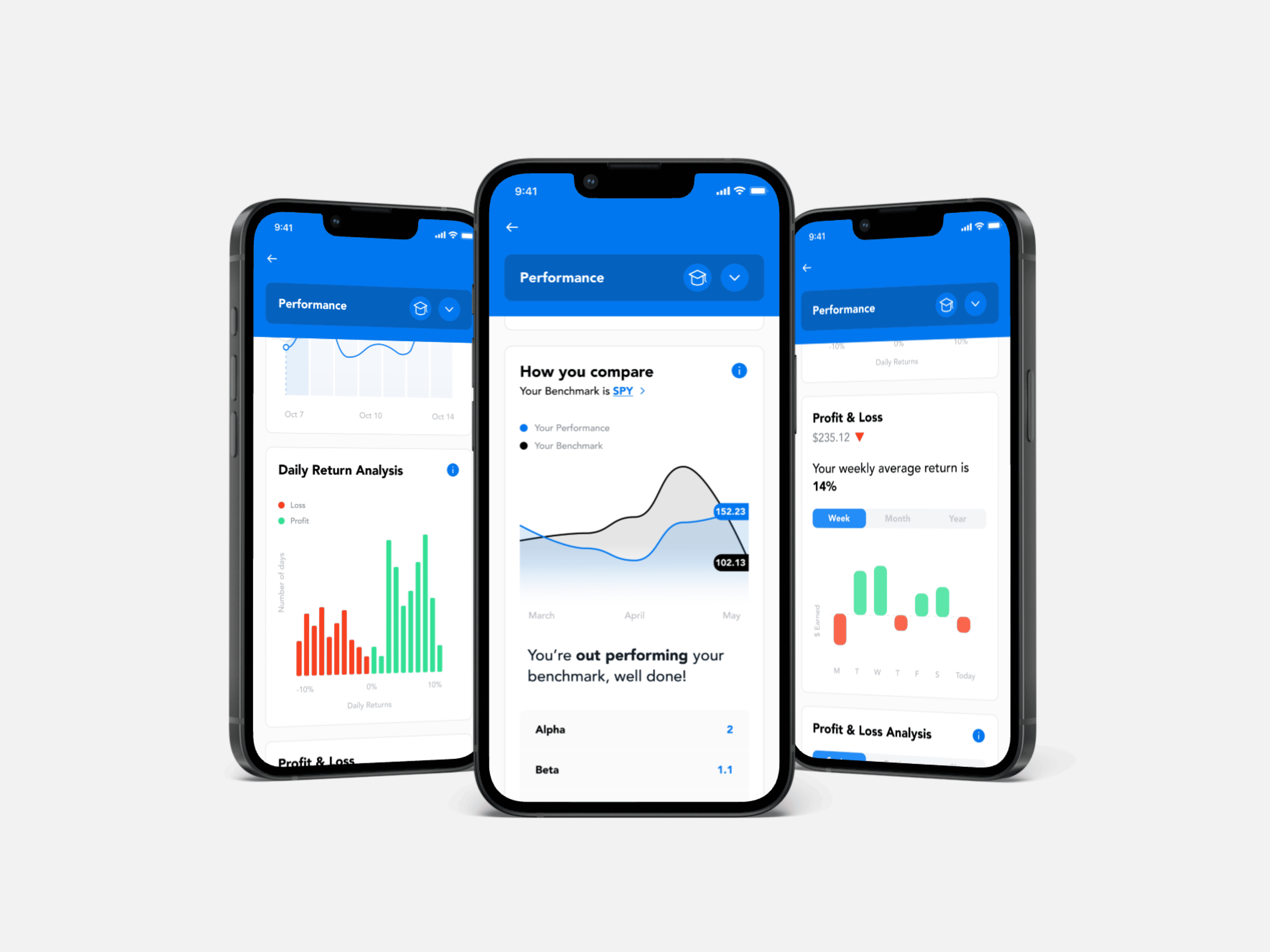
Expandable charts
To reduce cognitive load, we made charts collapsible. Users could scan headlines quickly, then expand for deeper insight.
In-context tooltips
We added subtle icons beside key terms. When tapped, users saw simple, plain-language explanations
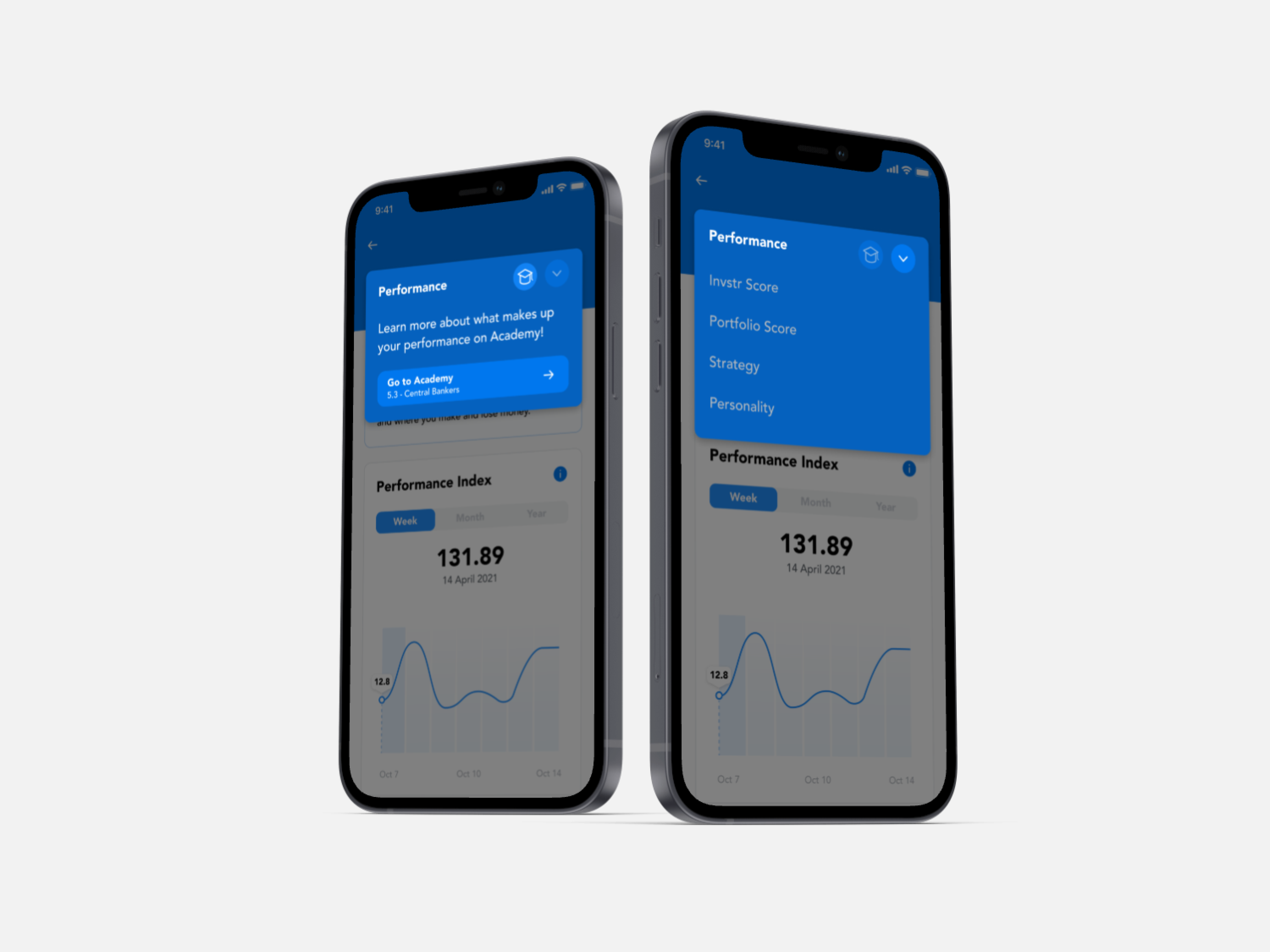
Sticky headers & grouping
We added subtle icons beside key terms. When tapped, users saw simple, plain-language explanations
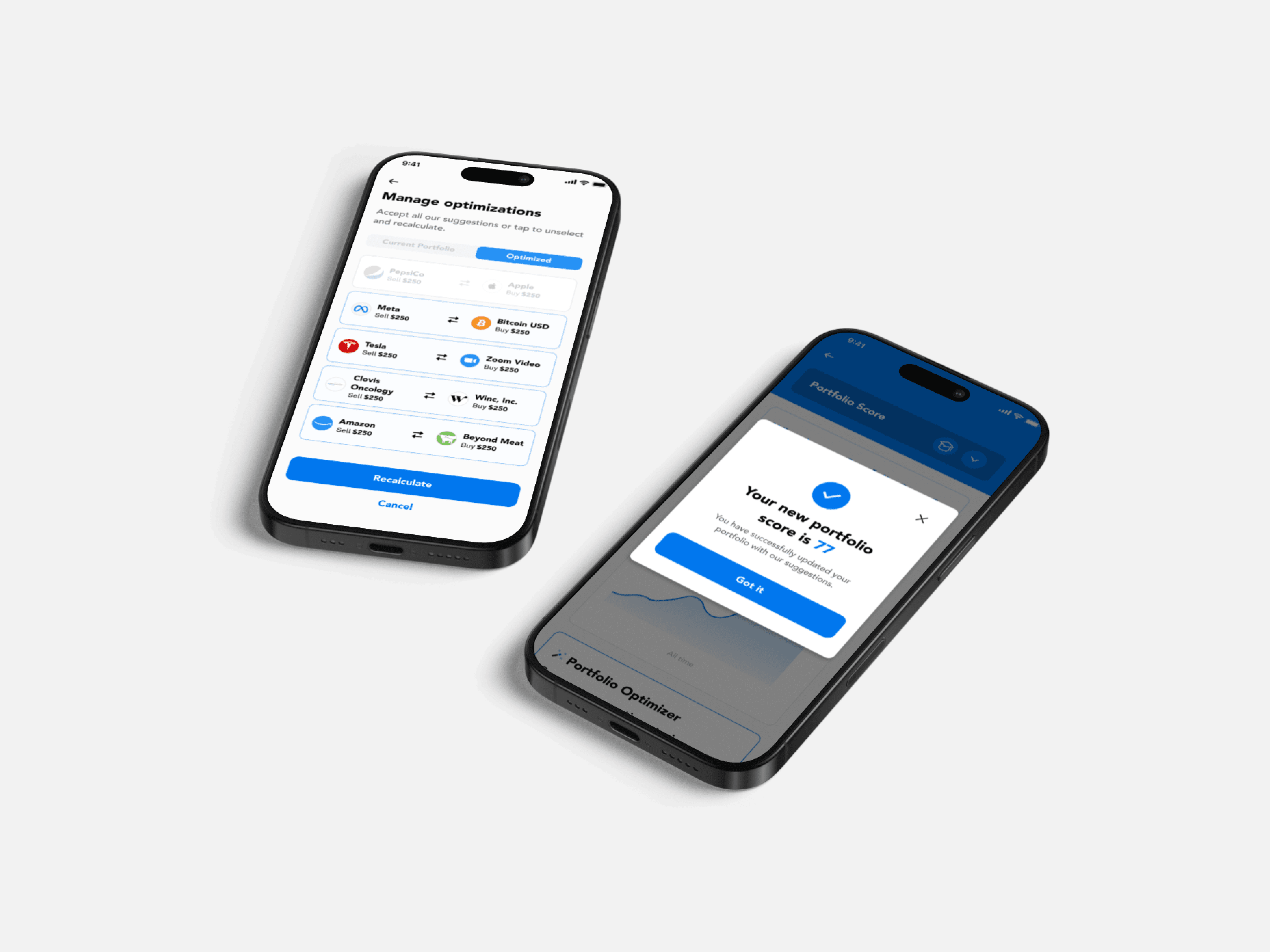
Key User Flow

Early Stages


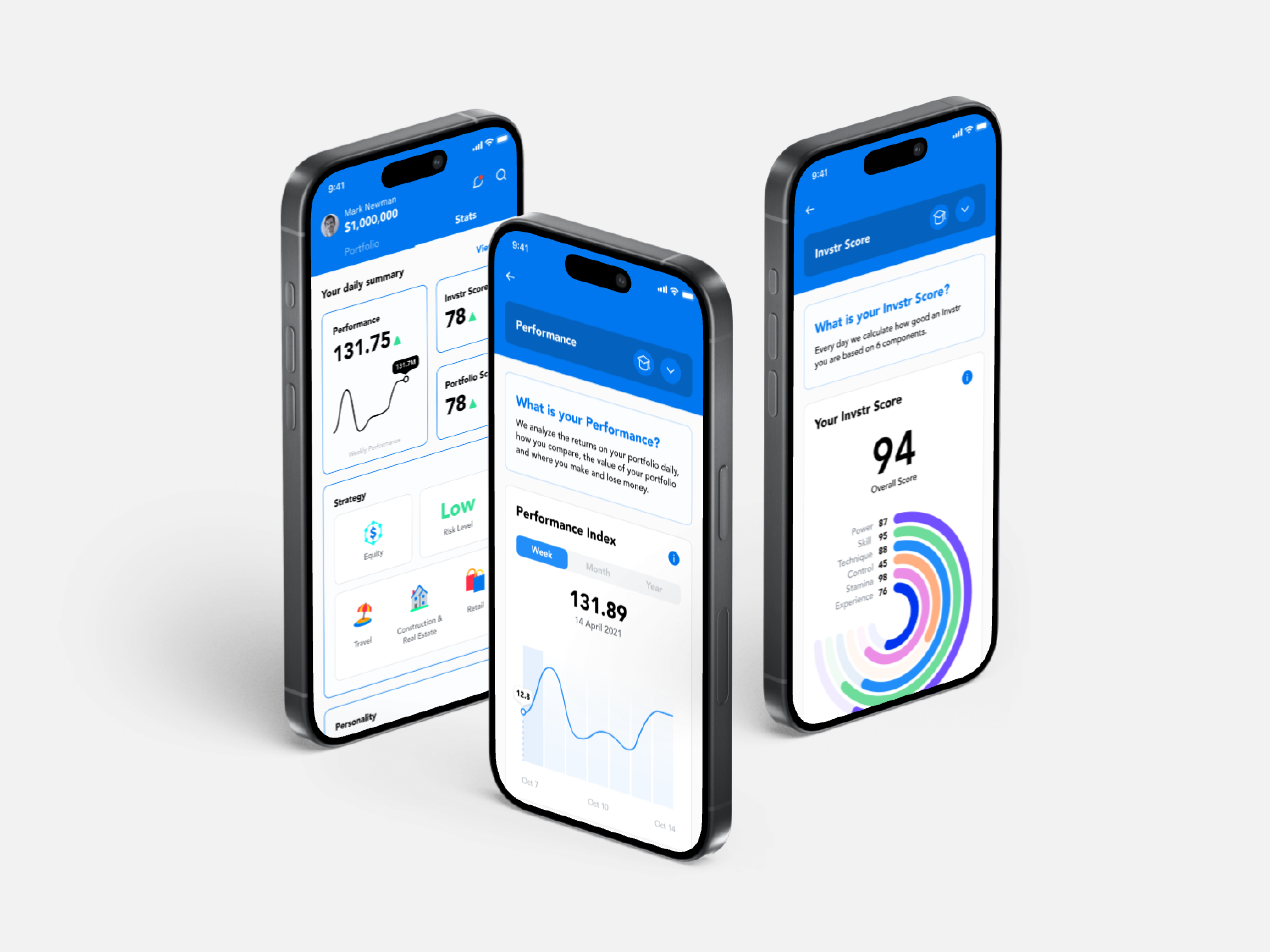
Old vs. New
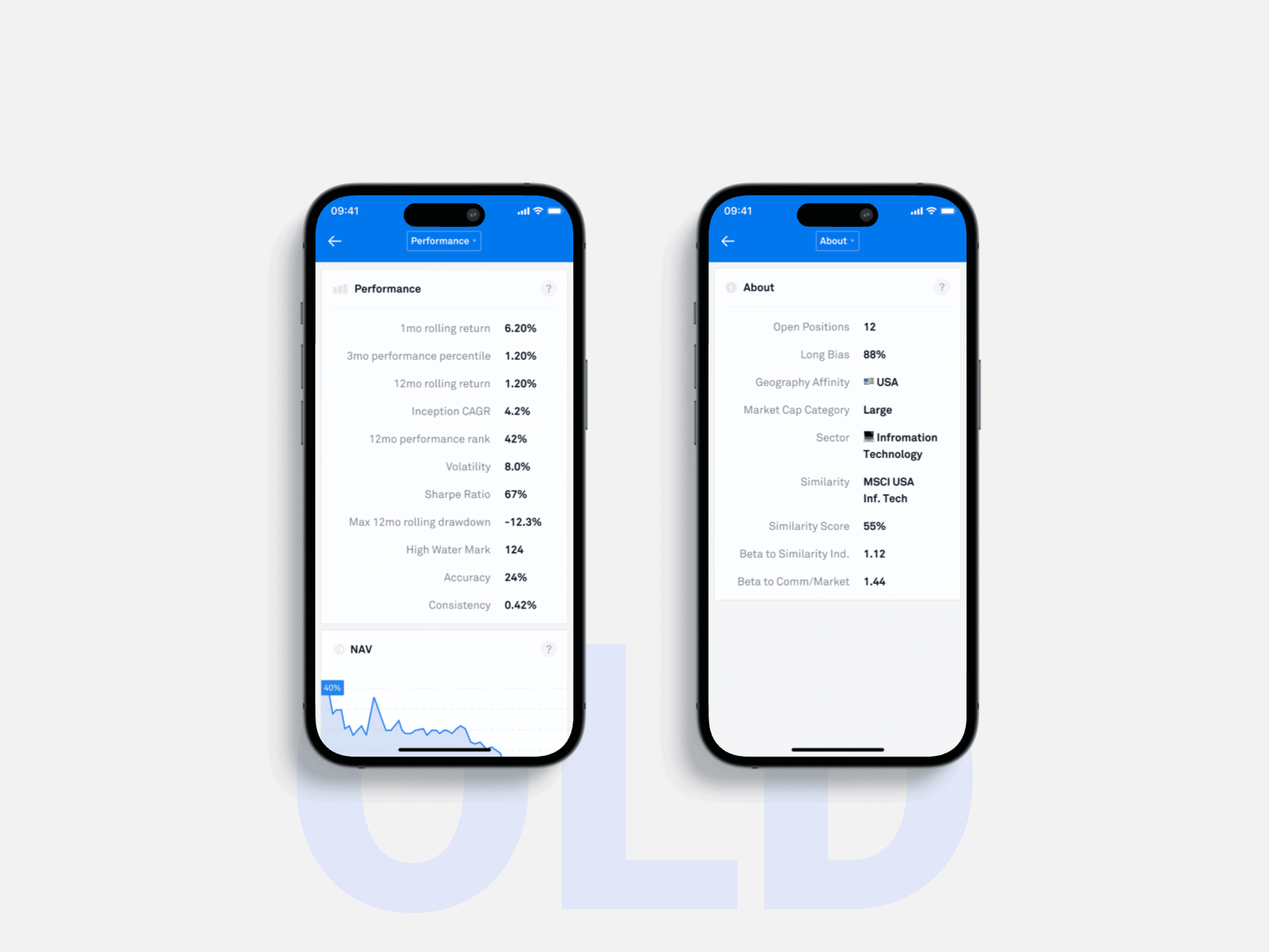
No educational support, overuse of financial jargon & lack of visual hierarchy
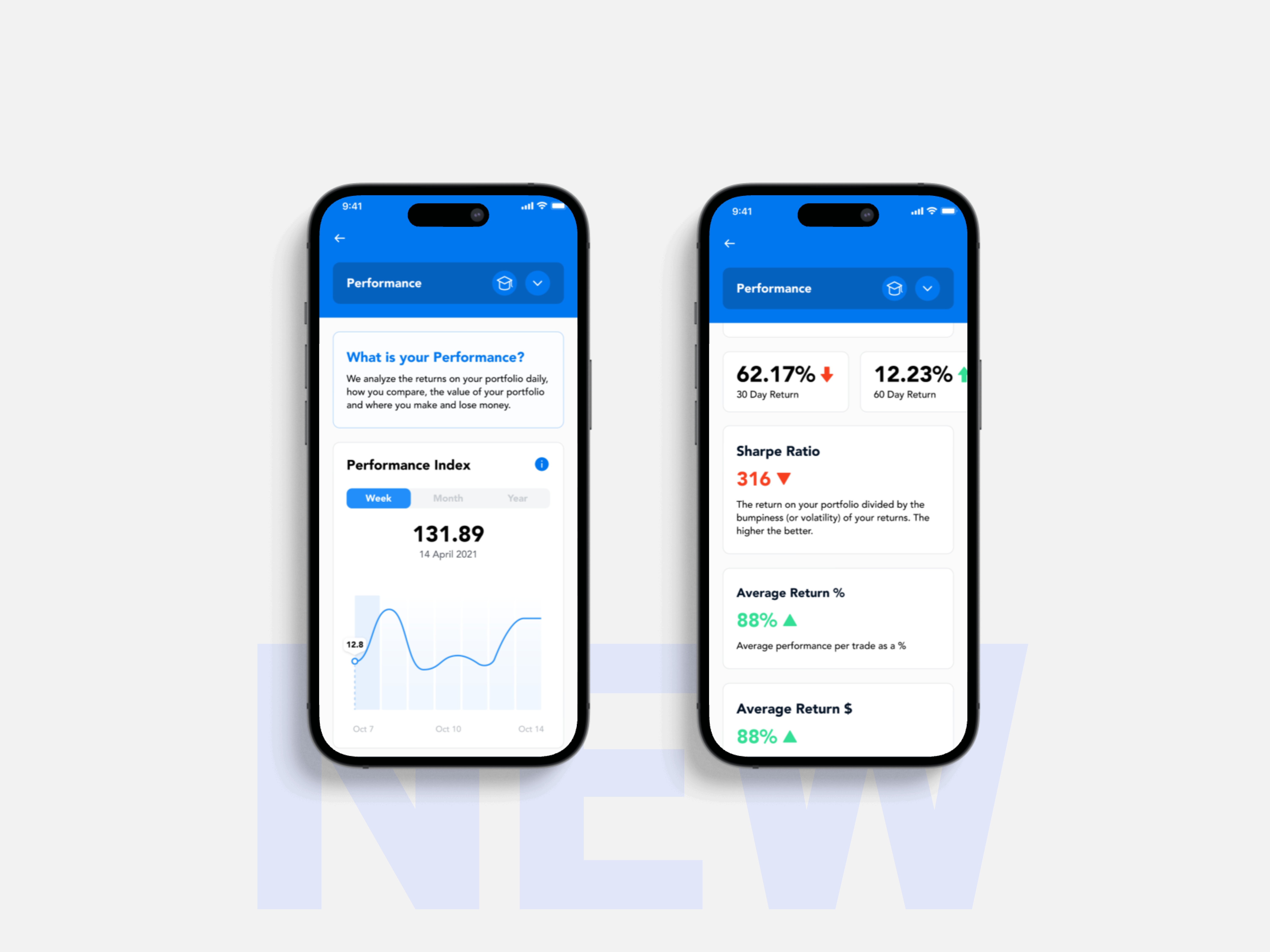
Interactive charts and visual aids, boosted educatio and guided improvements, grouped into 5 categories for easier navigation